Lining De Vinne Revival
2020
Brief
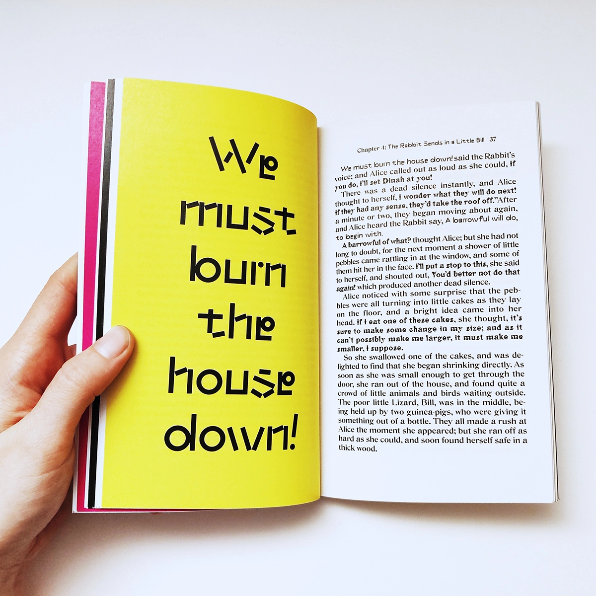
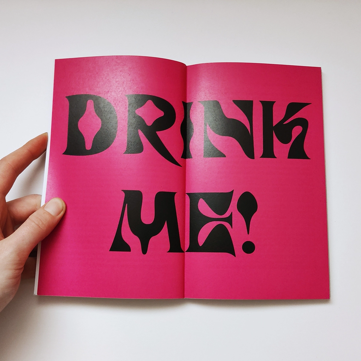
A typeface revival and reinterpretation project based on Lining De Vinne, discovered in an American specimen book featuring historical designs that were never digitized.
Design Process
The original's elegant curves and distinctive character shapes inspired two contrasting interpretations. Suspirium amplifies the typeface's surreal qualities, pushing its unique forms into more experimental territory. Elemental serves as a counterpoint—maintaining geometric rigidity while respecting the original's underlying structure. Working in RoboFont proved challenging but invaluable, requiring meticulous attention to kerning, spacing, and character consistency across multiple weights and styles.
Reflection
The process deepened my appreciation for typographic nuance and the precision required in professional type design. This project fundamentally changed how I view typography—transforming fonts from tools into carefully crafted systems deserving close examination and respect.